

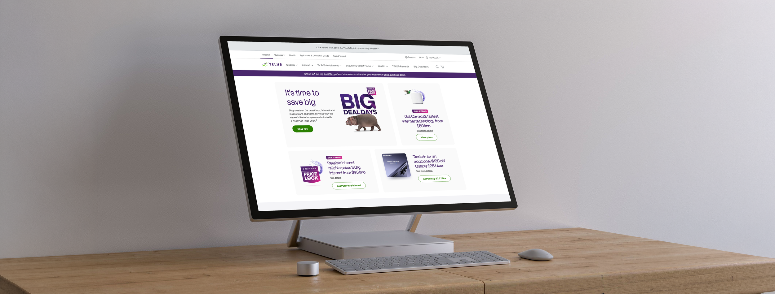
a new TELUS home page
Overview
Leading the redesign of the TELUS consumer homepage and introducing a new carousel component into UDS (Universal Design System), boosting CTR to 6.35% from 4.83%, and improving cart finish rate to 55.2% from 44.8%, while providing a modern new feel.
Tools: Figma, Figjam, Adobe Analytics, Google Meet, TELUS Universal Design System (UDS)
The previous homepage presented key opportunities to improve offer engagement rates, carousel performance, and enhancements to the overall look and feel of the page. The outdated UDS carousel experienced high drop-off rates in engagement on each successive slide, providing a clear incentive to reimagine the carousel component to improve business KPIs, while also bringing the above-the-fold experience up to modern standards.
Discovery / Analysis
analysis of the previous design
Previous TELUS homepage (above fold experience)
Some key data points
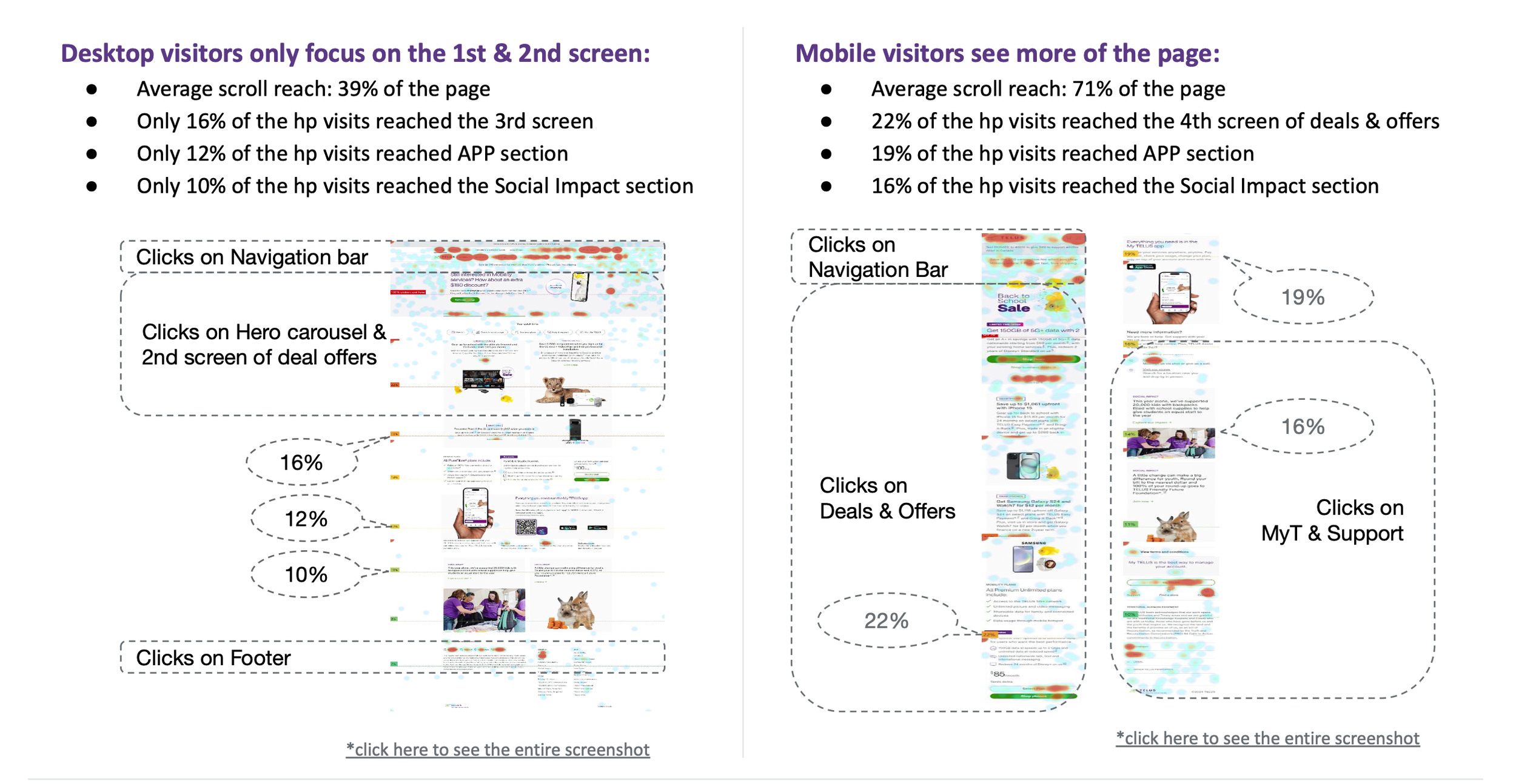
60% Desktop / 40% Mobile split


16% scroll reach below the fold
25% page bounce rate

Avg. weekly traffic 260K

traffic overview
Volume & Sources: The homepage receives 260,000 visits per week (12% of total site traffic), primarily driven by Direct (48%) and SEO (28%) channels.
Audience Profile: Traffic is dominated by returning visitors (62%) and existing customers (67%), with 60% of users accessing the site via desktop.
User Engagement
Retention: The homepage maintains a 25% bounce rate, which is significantly lower than the site’s overall average of 43%.
Interactions: Of the 75% of users who interact with the site, the majority (46%) click on in-page content to find deals, while others use the navigation menu or seek support services.
primary IMPACT
The first two positions capture the vast majority of user interest, with Position 1 leading at 3.69%.
The "Cliff" Effect
There is a massive decline in engagement after the second slide. Engagement drops from 3.04% in Position 2 to a mere 0.04% in Position 3—a nearly 99% decrease.
Negligible Visibility
By the time a user reaches Position 4, engagement is almost non-existent at 0.01%.
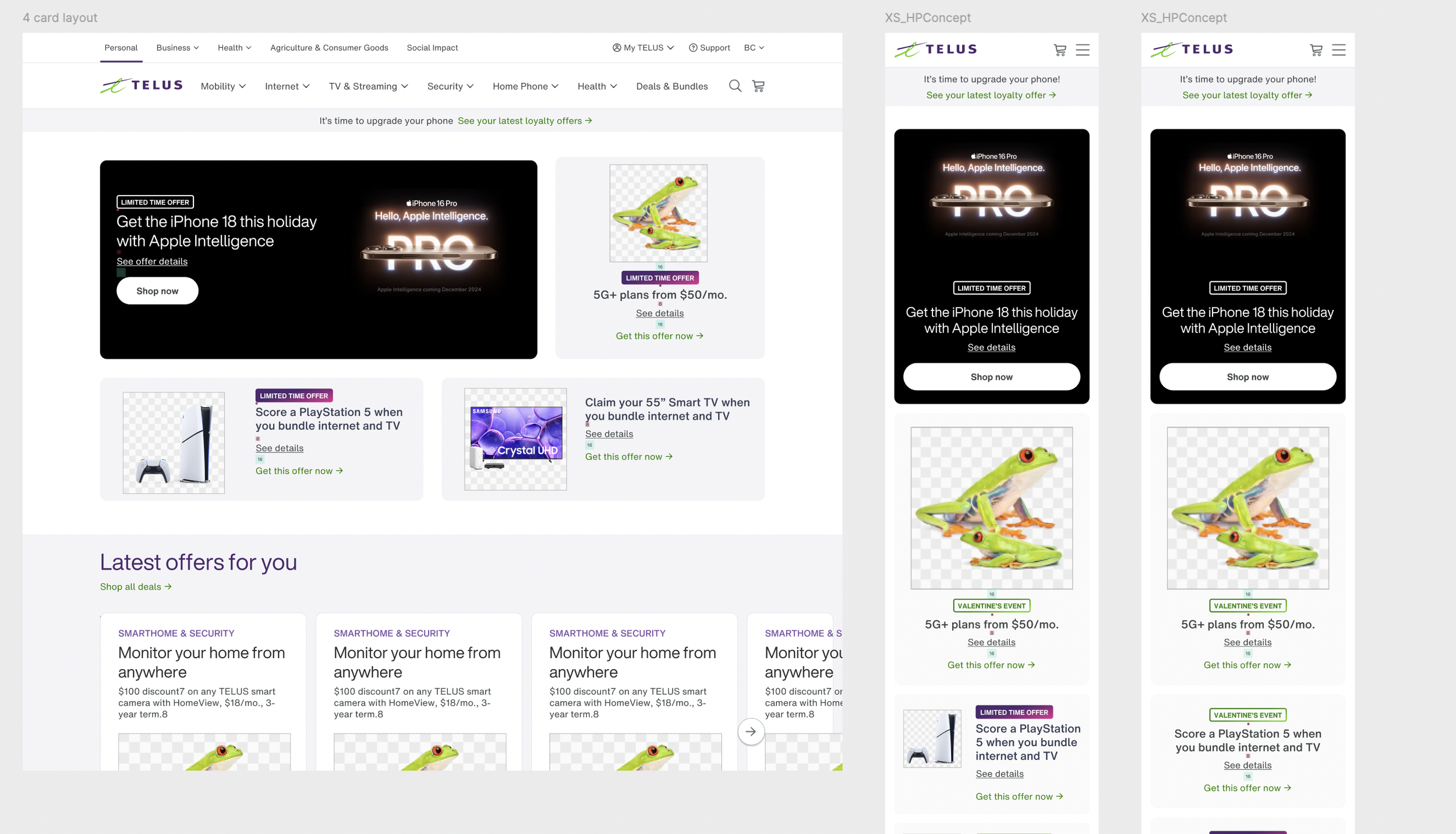
I hypothesized that replacing the hero carousel with a multi-item layout would increase offer engagement while significantly improving accessibility by removing the autoplay feature. Below is my exploration of this new component for the Universal Design System (UDS), focusing on user-controlled navigation and higher information density.
Design System
designing a new multi-item carousel component

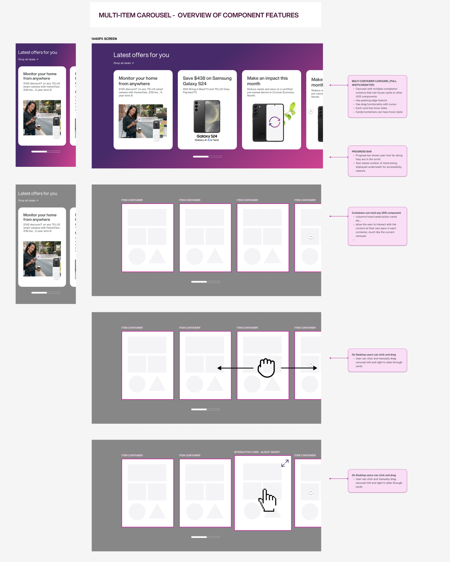
The new carousel design should allow visitors to see more offers at once on the viewport by utilizing a multi-item display system. This strategy allows us to match the homepage to current industry standards, while new standards for copy and content create more scannable content that increase readability on the page.
Design
New carousel component
-
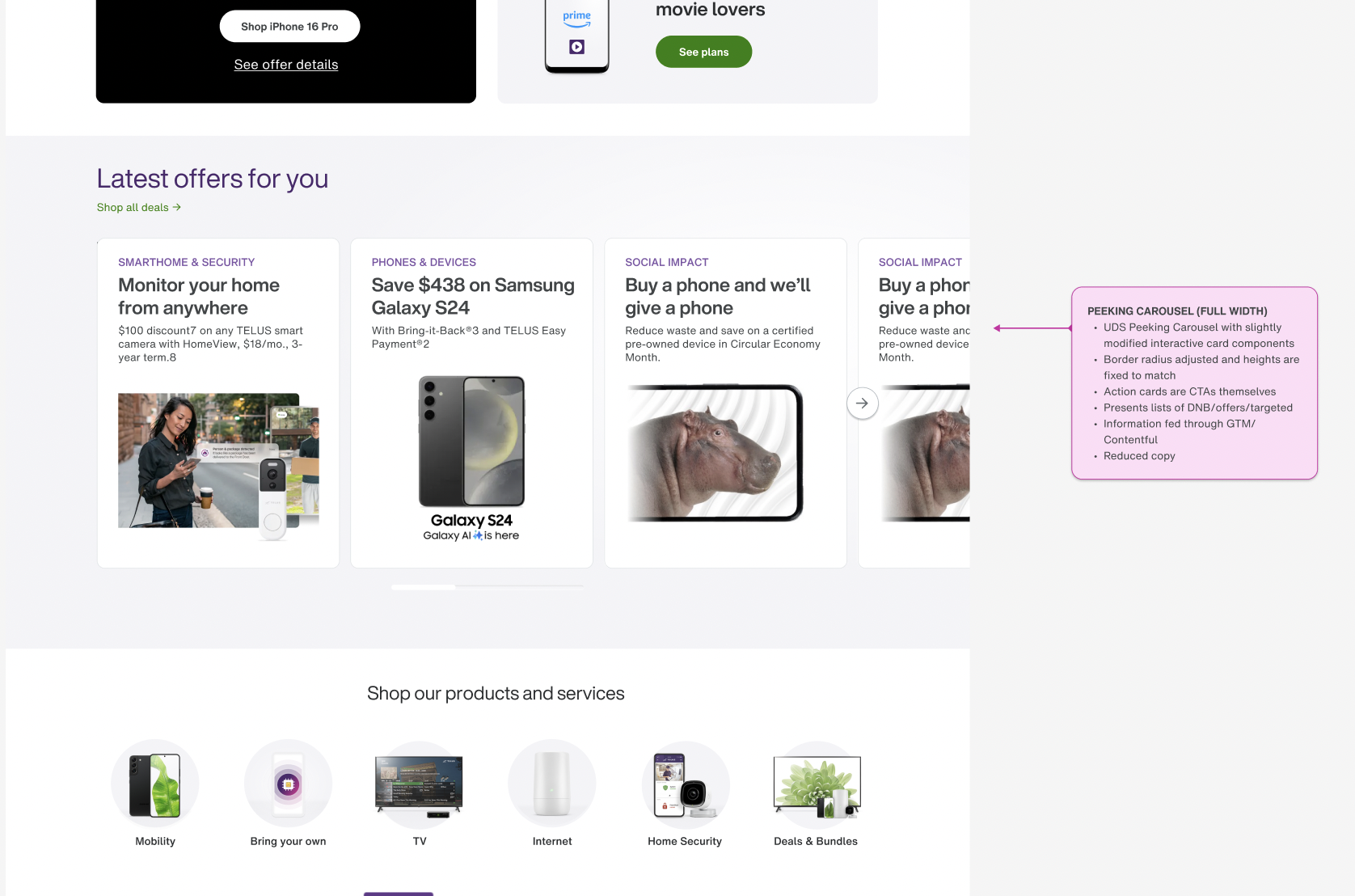
Expanding the click target to the entire card eliminates the need for redundant CTA buttons, reducing visual noise. This creates a cleaner, more focused layout that prioritizes content while maintaining a high level of usability.
-
We established character limits and line-wrap constraints for the carousel components: a maximum of three lines for headings and two to three lines for body copy. This ensures a consistent visual rhythm and prevents layout shifting across various screen sizes.
-
Top-aligned badges serve as visual anchors, enabling users to quickly identify and filter offer types by line of business offering (LOB). This reduces cognitive load and streamlines the path to conversion.
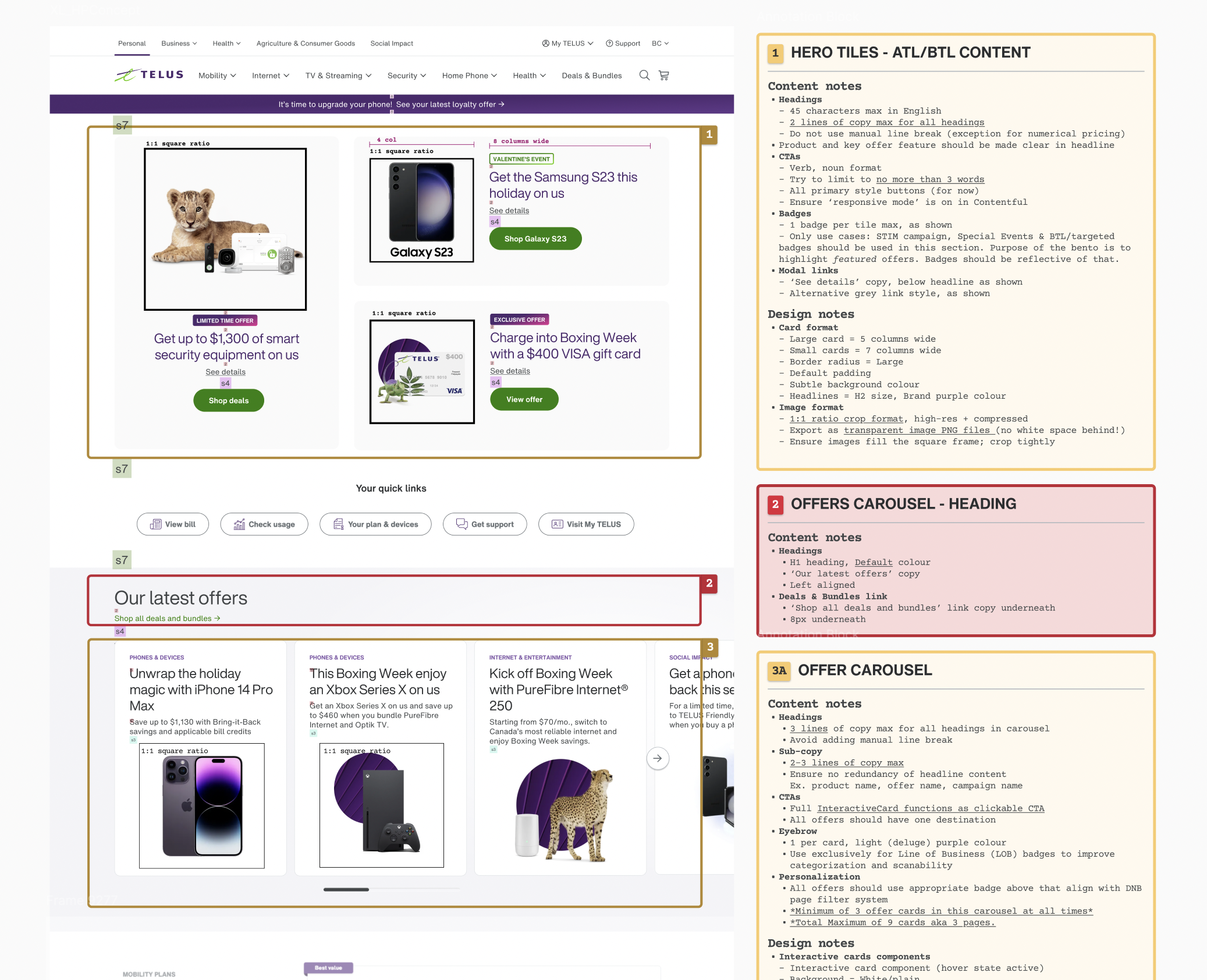
The following slides outline the design rationale, mapping specific UX principles to measurable operational benefits. I developed and presented this strategy to key business stakeholders to secure alignment on the architectural shift and its projected impact on the product roadmap.
Design Strategy
the new ux strategy


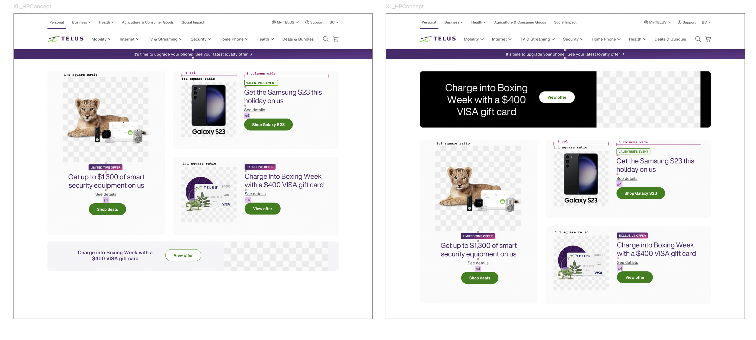
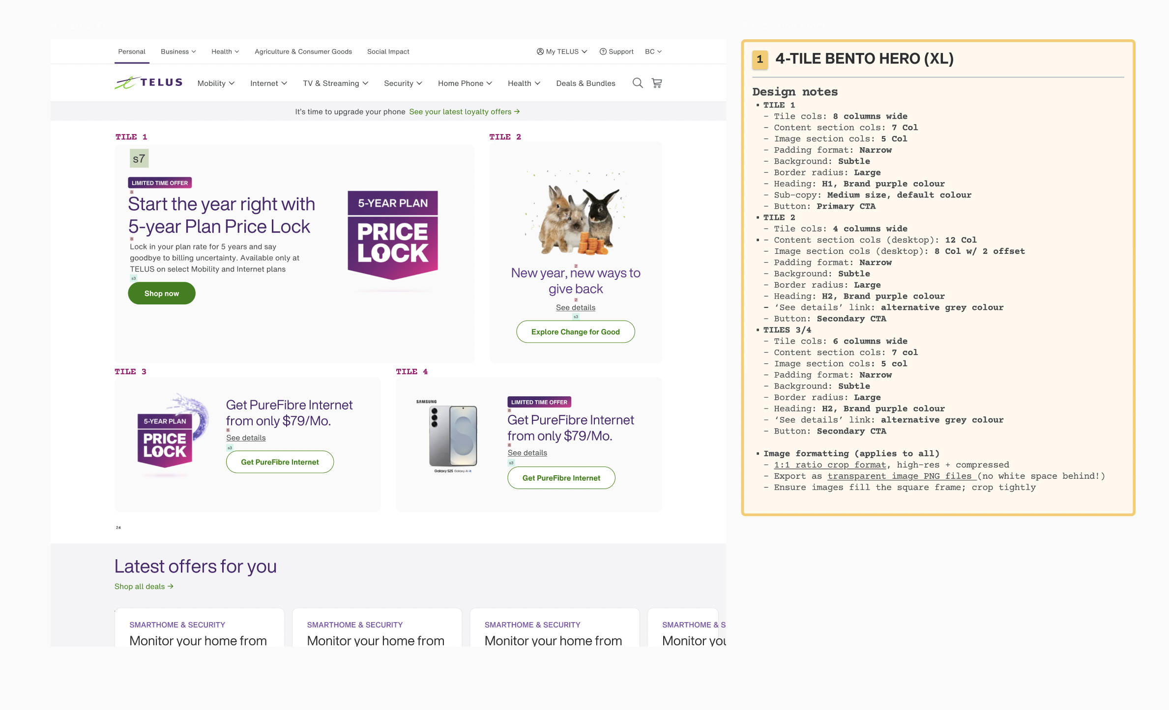
I designed a new bento-box interface to prioritize high-value Go-to-Market (GTM) offers—the primary revenue drivers for the business. Positioned above the multi-item carousel, this layout establishes a clear content hierarchy and modernizes the homepage aesthetic while ensuring business-critical promotions receive maximum visibility.
Design
new bento-box content system
content guideline strategy
Design Strategy and Collaboration
To manage the complexities of multi-stakeholder content ownership, I developed standardized design and copy guidelines to prevent fragmented user experiences. By fostering collaborative partnerships with the Go-to-Market and Content teams, I ensured that frequent offer updates remained compliant with our established UX standards.
Behold!
〰️
Behold! 〰️
the new look and feel
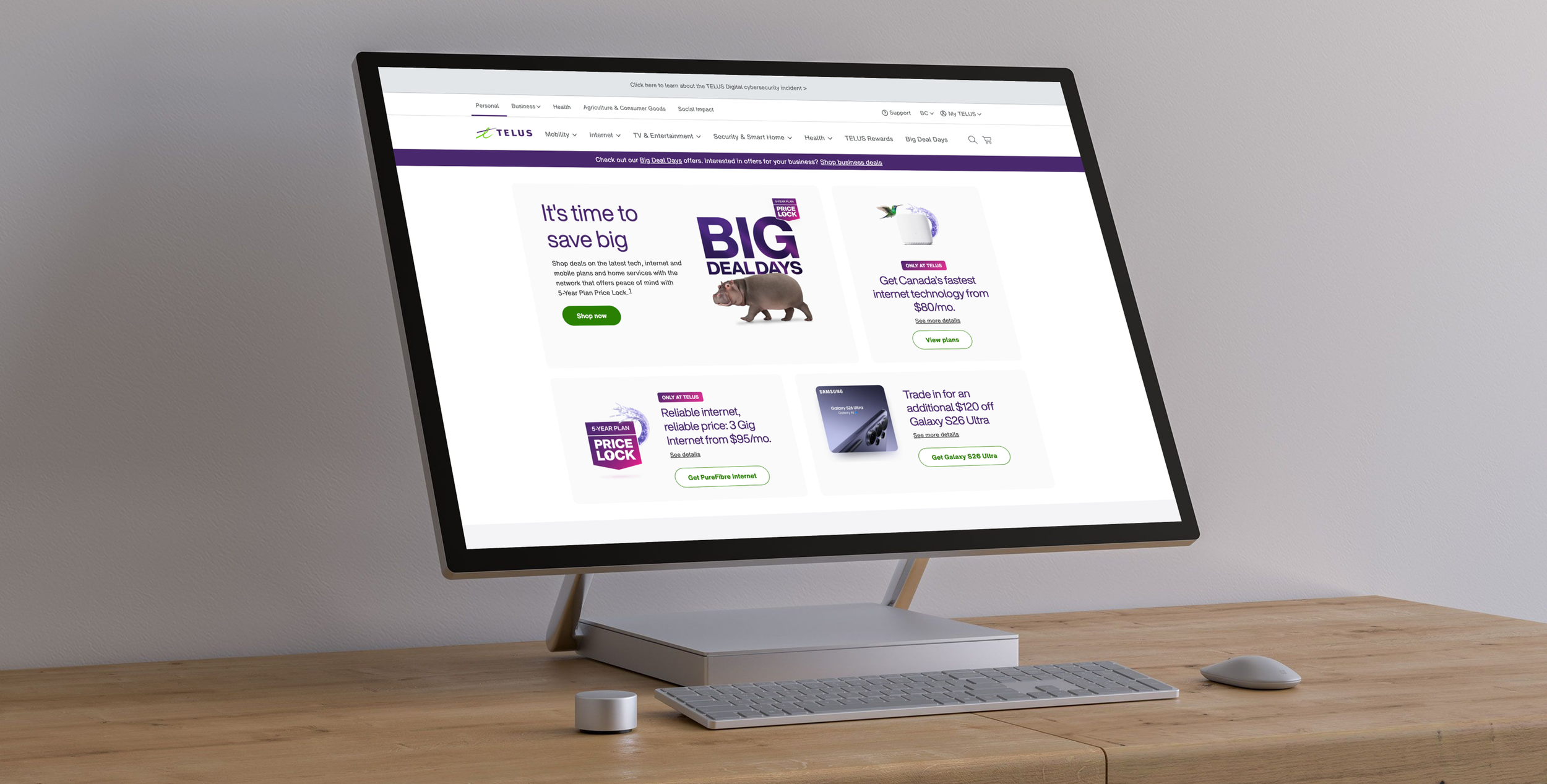
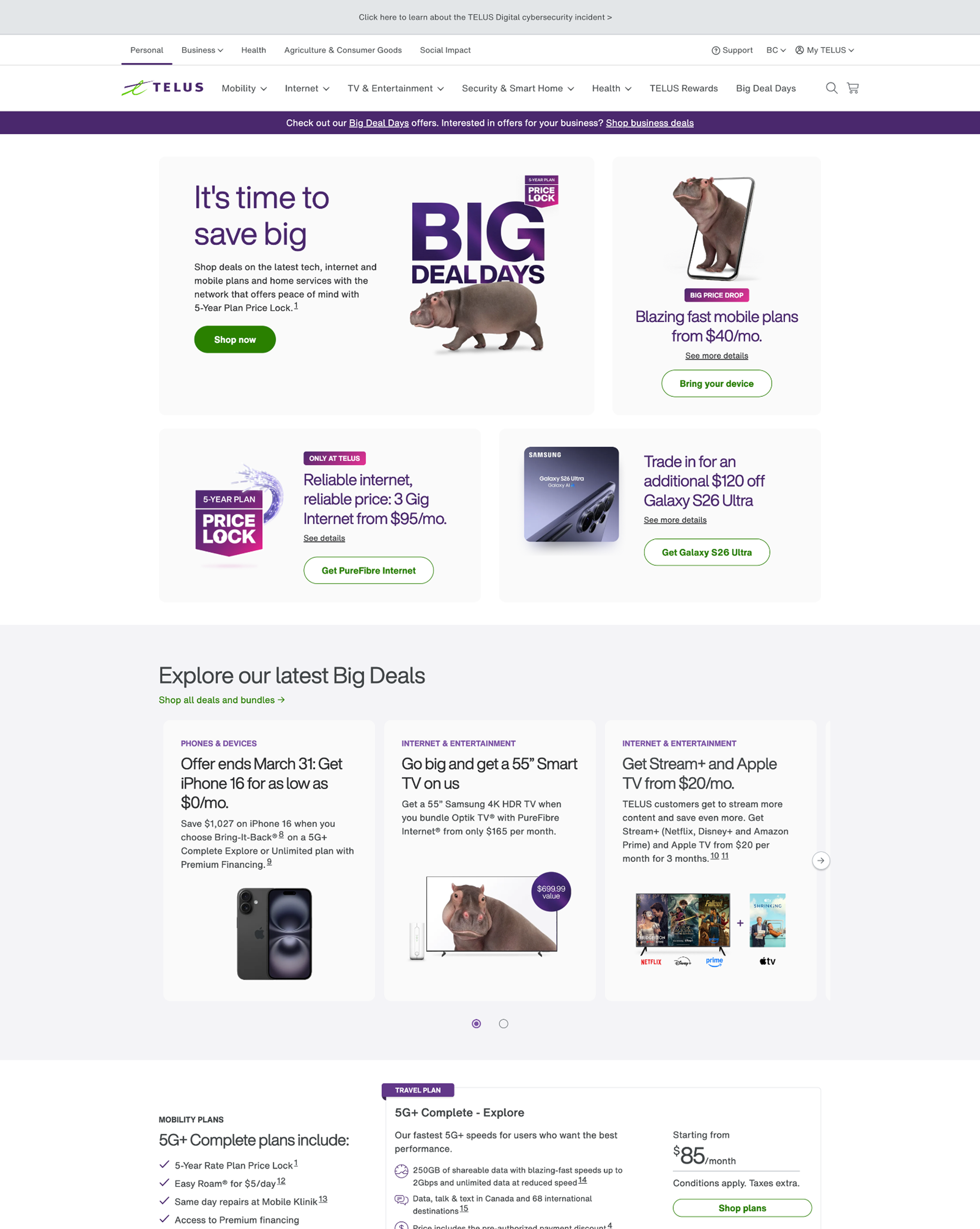
Results from the 50/50 A/B test indicate that the new homepage design outperformed the control across all key metrics. Notably, the CTR increased from 4.83% to 6.35%, while the cart completion rate saw a significant lift from 44.8% to 55.2%. The redesign has received positive feedback from both internal stakeholders and customers.
Higher Conversion Rates: The overall homepage conversion rate (CVR) improved from 0.55% to 0.61%, while the CVR for users who clicked on the page increased from 1.91% to 1.98%.
Analytics
A/B test results
Reflection on the process
Influence on TELUS
Instead of various teams fighting for the #1 "prime real estate" position on the original homepage carousel, this new design allows for more cross-team synergy
Bento-style layout creates visibility for more top-layer offers for desktop users, which accounts for 60% of visits to the consumer home page
The success of the 50/50 A/B test—specifically seeing the CTR jump from 4.83% to 6.35%—standardized the use of "Evidence-Based Design” for future projects on my team
This project solidified my design leadership throughout the organization, as someone who can effectively translate analytics data and research into coversion-driving design changes on high-traffic pages
my design approach
I believe in data-backed design at every step of the journey
The TELUS homepage is the highest-traffic page on the entire site, and serves as the first impression of the brand for 10s of millions of Canadians nationwide - therefore, you can imagine the political theatre necessary to get stakeholders at every level on board with the new design approach
It was important to me that every decision came backed with recent analytics data (heat-maps, scroll-depth, engagement rates, CTR etc.), UX heuristics best-practices, accessibility considerations, and more - so that I would be well-equipped for any question thrown at me along the way
Technical constraints had a large influence on the final design of the page, but that is to be expected in any enterprise organization; luckily for me, I feel that constraints actually unlock my creativity even more
challenges and bottlenecks
One of the main bottlenecks of this design project was the reliance on the UDS Design System team to help develop the new multi-item carousel component
The UDS team decided to integrate the multi-item carousel as a feature of the existing carousel, rather than creating a net new component
Integrating the new carousel into the existing codebase created certain constraints and some performance issues, which was disappointing
I had hoped to also add an interactive progress bar/slider to the new carousel system that met WCAG 2.2 accessibility standards, but this posed to be a large problem, and for now the progress indicator is still static (causing some UX concerns personally)
Cross-team collaboration
One of my main assets as a designer is my ability to collaborate with other teams, stakeholders, and product managers
I can empathize with the motivations of the Go-to-Market team, leadership requests, and the constraints that developers face, all-alike
One of the keys to this project’s success was the frequent surfacing of updates to necessary stakeholders, and open channels of communication on Slack to inform them of new content guidelines and restrictions
Working closely with our Go-to-market partners was a pleasure, and they were ultimately happy with the increased marketing real-estate that this new design enabled, and the potential that it would unlock